Introduction
In 1999, I created and first documented the market maker method of trading financial markets. The method consists of three market phases: Accumulation, Manipulation, and Distribution (the distribution phase is also known as the profit release phase).
The method revealed how market makers and large institutions engineer price movements through the three repeating phases. PAT is the original AMD indicator, visualizing this 26-year-old framework in real-time on TradingView.
Ready to add PAT to TradingView? Get started.
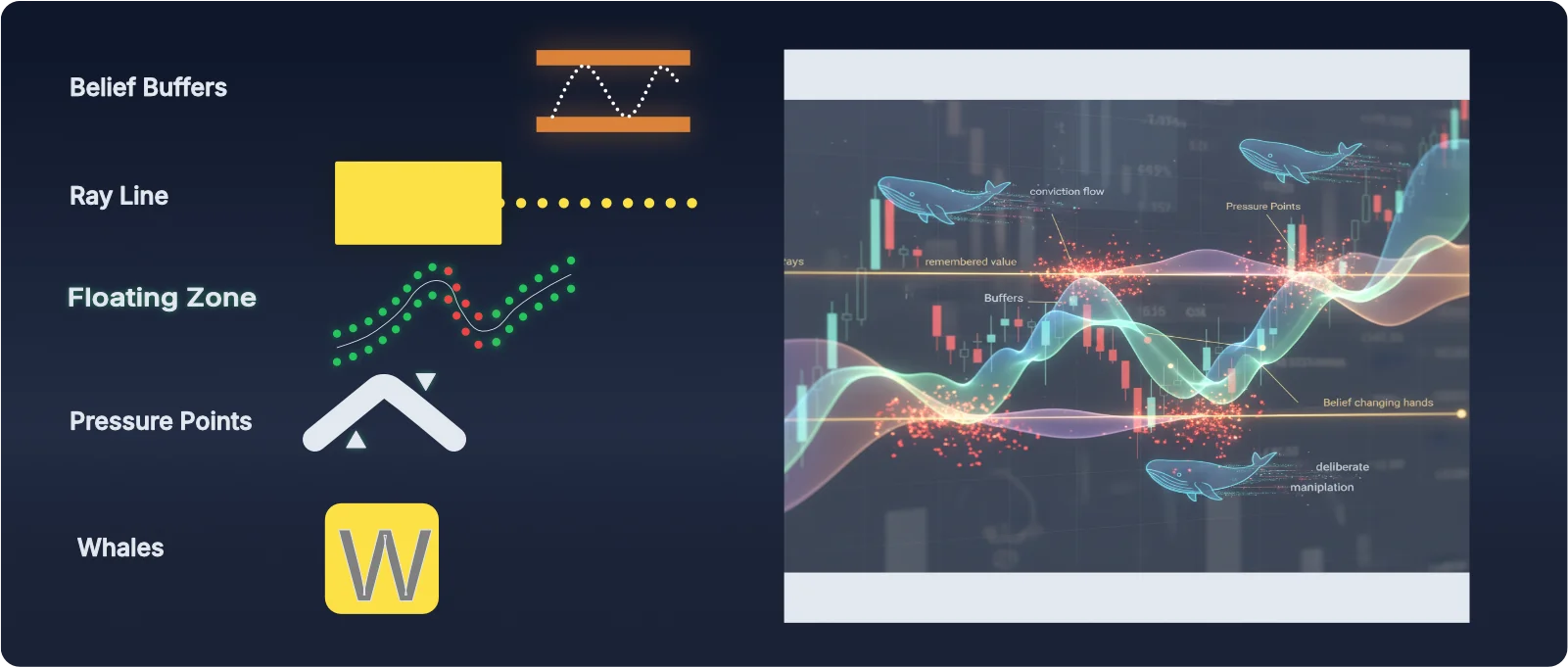
Most traders study candles (the form) and miss belief (the content) that actually moves price. The PAT Indicator reveals belief directly: The Floating Zone reveals underlying strength and weakness. And confirmation of trend change, Buffers reveal manipulation zones—where market makers test belief and trap retail traders, Whale Markers show where professional, large trading positions enter and exit (Smart Money Concept), Ray lines show where accumulation pivots on underlying strength or weakness, and Pressure Points show where conviction starts to become fractured. Early warning signs that the current move is showing signs of fractured beliefs. Read belief and you’ll stop reacting to traps.
PAT = The Original AMD Indicator
PAT visualizes the AMD cycle (Accumulation, Manipulation, Distribution/Profit Release) that Martin Cole created in 1999. This manual shows you how to read each phase in real-time. For the complete AMD framework explanation, see What Is the AMD Indicator?
Principle: Form vs. Content
Prefer Video? Watch the Training Course
This manual covers the complete PAT framework in written form. Learn to trade the AMD cycle, not predictions, by reading the five elements that reveal institutional conviction. If you're a visual learner, check out the PAT Training Course where Martin demonstrates each concept on live charts with real-time analysis.
Getting Started
Before you can start reading the AMD cycle with PAT, you'll need to add the indicator to your TradingView chart. This is a simple process that takes just a few seconds.
Adding PAT to Your TradingView Chart
To add the PAT indicator to a TradingView chart:
- Click the "Indicators" button at the top of your chart, or press the slash key (/)
- In the search bar, type: PAT [martincole]
- Click on the indicator to add it to your chart
That's it. The indicator is now active and displaying the AMD cycle elements on your chart.
Indicator Settings
The PAT indicator comes with default settings that work well for most markets right out of the box. There is no need to touch the settings unless you are trading exotic instruments or instruments with a large array of decimal places.
Note: In trading, "exotic instruments" are complex financial derivatives with non-standard features that differ from simpler, "plain-vanilla" options.
For the vast majority of users trading standard forex pairs, indices, or stocks, the default settings will work perfectly without any adjustments.
Ready to Use
Once the indicator is added to your chart, you can start using it immediately. The five elements—The Floating Zone, Ray Lines, Pressure Points, Buffers, and Whale Markers—will automatically display on your chart, revealing the AMD cycle in real-time.
Need Help?
If you have any questions or something you're not sure about, please open a support ticket using our contact form. We're here to help.
Quickstart: Read a Chart in 20 Seconds
- Find The Floating Zone: note its slope. Up = strengthening belief; down = weakening belief.
- Locate the nearest ray line: expect a test of remembered conviction.
- Scan for Pressure Points: clusters on one side = belief is cracking.
- Pay attention to Buffers: Look for the challenge to them and remember this is not a challenge of ‘price’ this is a challenge of collective beliefs.
- Whale markers: The name says it all. You are observing large players. It’s just another form of manipulation of price to manipulate BELIEFS and Accumulate / Distribute (off load).
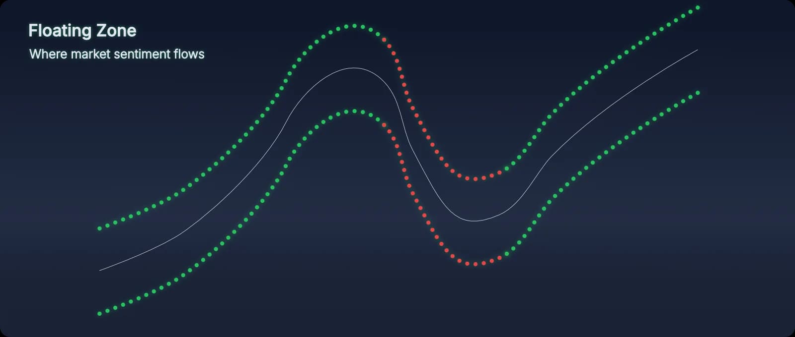
The Floating Zone
The Floating Zone is the foundation of PAT—it shows the flow of crowd conviction in real time. Unlike static indicators that lag behind price, The Floating Zone adapts dynamically to show you where collective belief sits right now.
Understanding The Floating Zone’s Structure
The Floating Zone has three components:
- The midline: Where belief is most comfortable. This is the path of least resistance—where the market “wants” to be.
- Upper and lower boundaries: Define the width of the conviction zone. Wider Floating Zone = higher volatility and uncertainty. Narrower Floating Zone = tighter consensus and calmer conditions.
- The slope/bend: The direction The Floating Zone is flowing. Bending up = strengthening buying conviction. Bending down = unwinding belief, selling pressure increasing.
What The Floating Zone Tells You
Floating Zone direction is conviction direction. When The Floating Zone slopes upward, buyers are in control and their belief is strengthening. When it slopes downward, sellers are gaining conviction and buyers are retreating. Price rarely strays far from The Floating Zone without a specific structural reason (rays, buffers, manipulation).
Floating Zone width reveals confidence. A narrow Floating Zone means the crowd has strong consensus—everyone agrees on value at this level. A wide Floating Zone means uncertainty—the crowd is fractured, belief is scattered, and volatility is high. This tells you how much “room” price has to move unpredictably.
How to Use The Floating Zone
The Floating Zone isn’t a trading signal on its own—it’s context. It tells you the current of belief that all other elements operate within. When you combine The Floating Zone with rays, buffers, pressure points, and whale markers, you’re reading the complete picture:
- Floating Zone up + price at support ray line = alignment for long
- Floating Zone down + whale at resistance = prepare for reversal
- Floating Zone bending + buffer test = watch for break or rejection
- Wide Floating Zone + pressure points = high uncertainty, be cautious
When The Floating Zone Misleads
The Floating Zone shows crowd belief, which means it can be manipulated. Market makers know how to create the appearance of conviction to trap retail traders. This is why whale markers are critical—they reveal when The Floating Zone’s message is false. If you see a whale marker appear while The Floating Zone is showing strong conviction in one direction, be skeptical. The Floating Zone might be showing you the trap, not the truth.
Key principle: Trust The Floating Zone when it aligns with AMD phase boundaries (ray lines, buffers). Question it when whale markers suggest manipulation. The Floating Zone is powerful, but it’s not infallible.
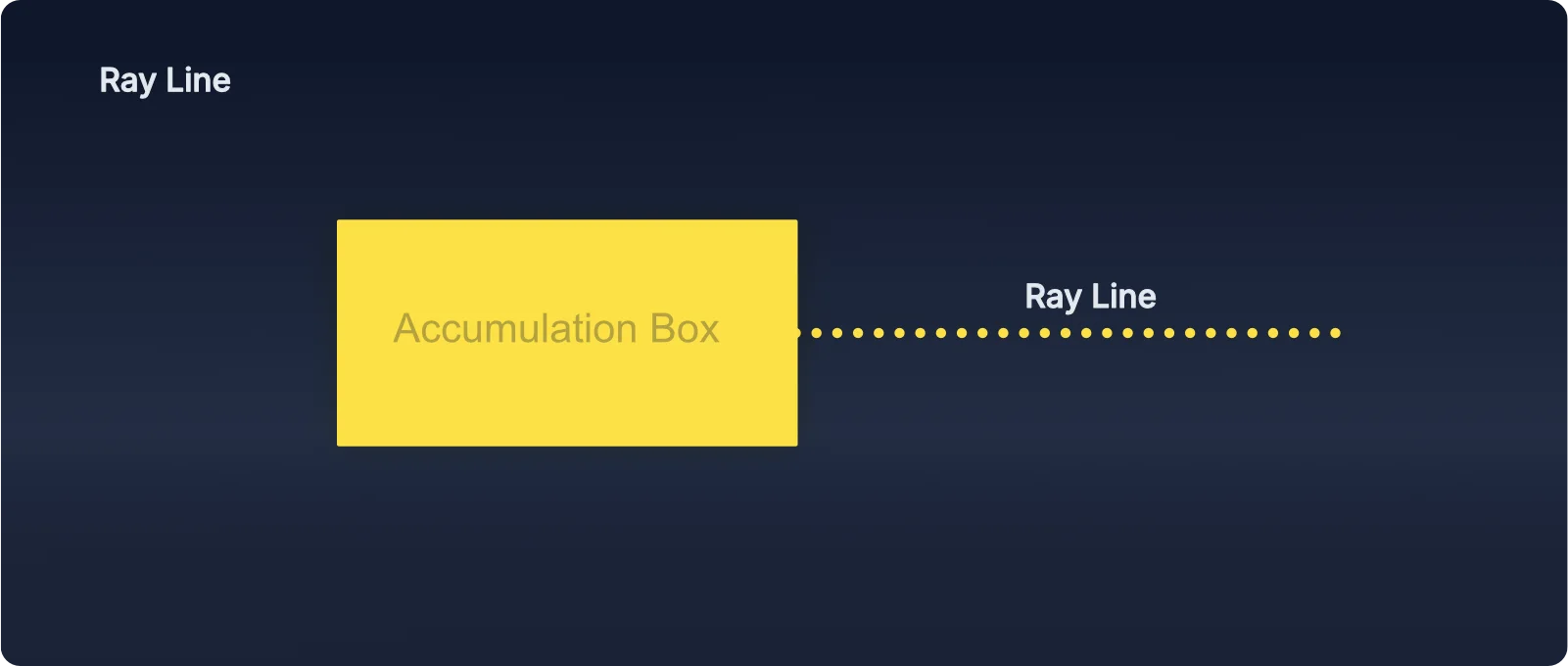
Ray Lines — Lines of Memory
Ray lines project from completed accumulation boxes. They are not arbitrary lines—they’re memory. When price returns to a ray line, it re-tests a place where belief was previously decided.
Ray line interpretation is context-dependent. Price above a ray line can signal underlying strength; price below can signal underlying weakness. However, how you use this information depends on market mode. In ranging markets (when buffers hold), ray lines act as internal pivot points within the range—not entry barriers. In trending markets (when buffers break), ray lines become confirmation zones where belief alignment matters. The Playbook section explains this distinction in detail.
Ray lines are dynamic—new ones form as the market moves and new accumulation zones complete. In a trending market, you’ll see new ray lines appear as price progresses. These aren’t just historical markers; they’re evolving reference points. A new ray line forming in an uptrend (above previous ray lines) acts as an updated structure level. If price stays above it, the trend continues with confirmed belief. If price falls below that new ray line, it’s an early warning that belief may be shifting—long before price would return to older, distant ray lines.
Pressure Points — Cracks in Consensus
Pressure Points (PP) flag where consensus starts to fracture. A cluster on one side of The Floating Zone is a warning that the dominant view is overextended. PPs are not signals on their own; they are context—tension that can resolve quickly once belief flips.
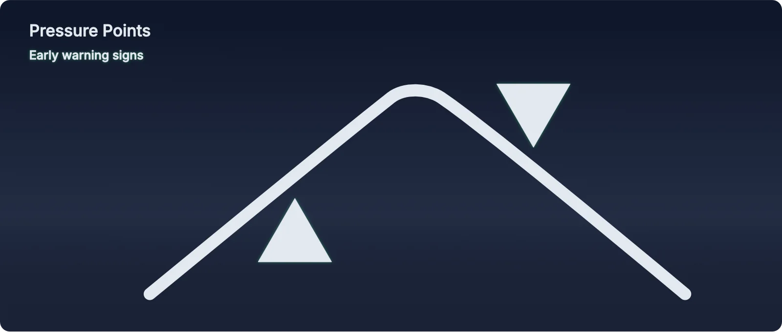
Tip: PP ≠ Buy/Sell
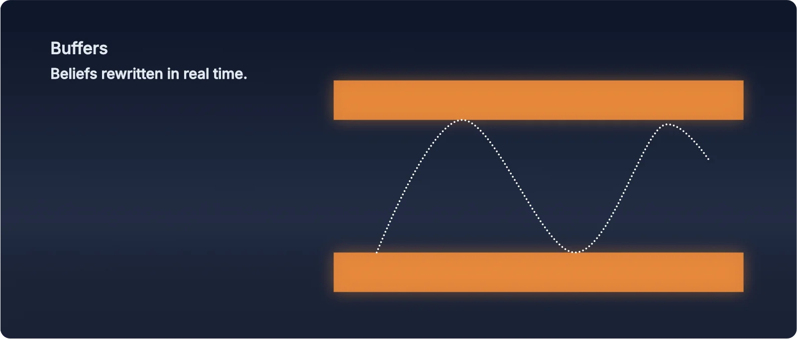
Buffers — Trading the Range Advantage
The Statistical Reality
Markets typically trend on 2 out of 5 trading days and range-trade on 3 out of 5 days. This creates a fundamental problem for trend traders: they’re fighting a 3:1 disadvantage. Most of the time, the market is oscillating, not trending—meaning trend traders spend 60% of their time getting chopped up in sideways action.
PAT’s core strength lies in exploiting this statistical reality. Buffers allow you to profit from range-bound markets, turning the 3:1 disadvantage into a 3:1 advantage.
What Buffers Actually Are
Buffers are AMD phase boundaries that define where collective belief has historically shifted. They’re not entry points—they’re decision zones that reveal the AMD cycle and directional intent. Think of buffers as the walls of a trading range. Understanding how price interacts with these walls tells you which AMD phase is active.
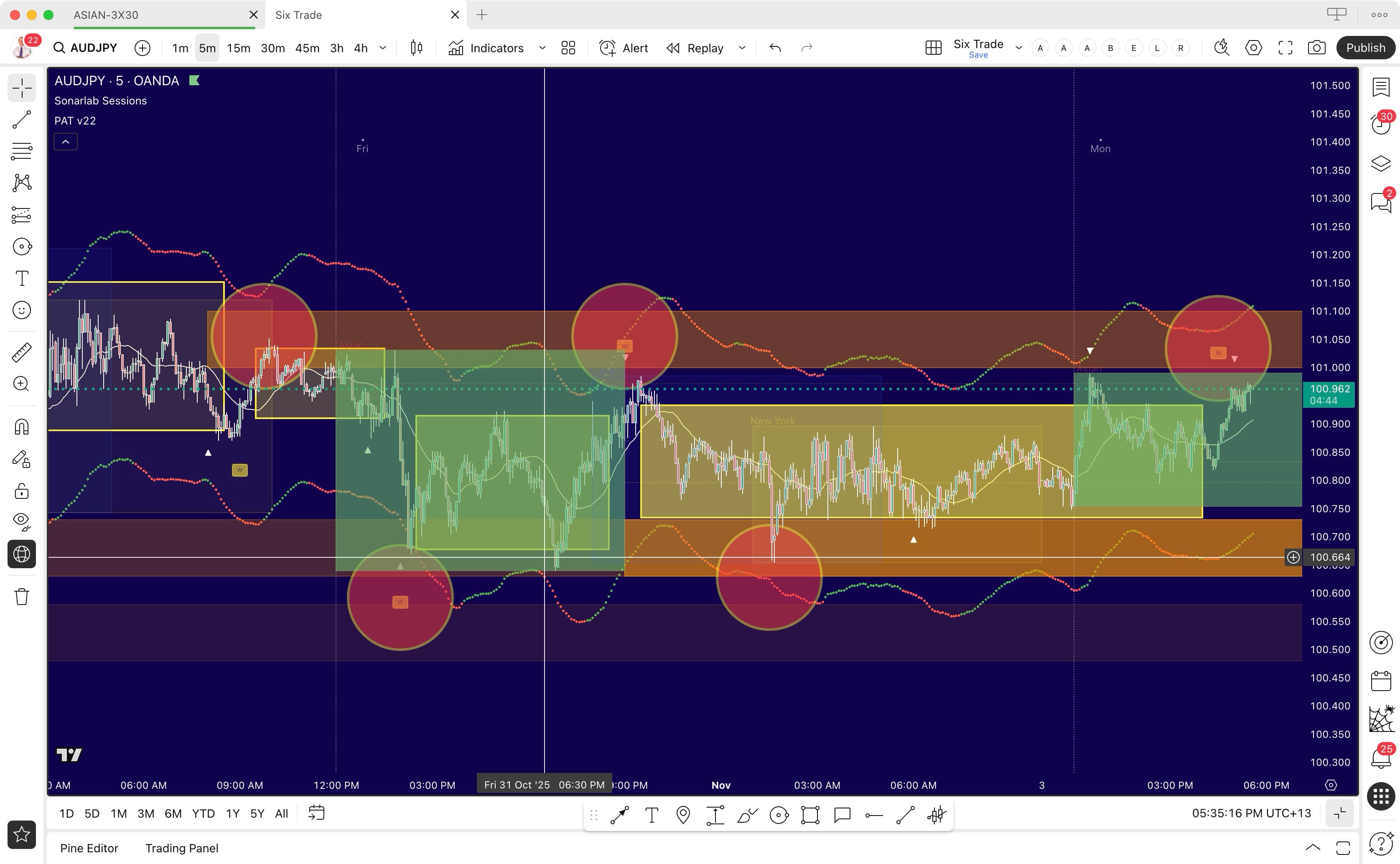
Real-World Example: Buffer Holds and Range-Bound Trading
The chart below demonstrates Scenario 1: Buffer Holds. Notice how price oscillates between the orange buffer lines—this is classic range-bound trading. Price repeatedly tests the upper and lower buffers, gets rejected, and moves toward the opposing buffer. The red circles are manually drawn to highlight key areas where price interacts with the buffers and where whale markers (small squares with “W”) appear, adding institutional weight to the rejections.
This is the type of AMD cycle behavior you’ll see 60% of the time—where most traders get chopped up, but where PAT gives you clear boundaries to trade the oscillation profitably.
Scenario 1: Buffer Holds (Range-Bound Trading)
When price approaches a buffer, tests it, and rejects back into the range, the buffer is “holding.” This signals the boundary is respected, collective belief hasn’t shifted, and the range remains intact.
What to observe:
- Penetration attempt: Price pushes into or slightly through the buffer
- Rejection: Price reverses back into the range
- Whale confirmation: If a whale marker appears during rejection, it adds institutional weight—confirming the buffer is defended
Trading guideline: After a confirmed rejection, position for a move toward the opposing buffer. The space between buffers becomes your “safe zone” for managing the trade. You’re not trading at the boundaries—you’re trading the oscillation between them.
Scenario 2: Buffer Breaks (Trending Move)
When price breaks through a buffer and continues beyond it, the buffer has failed. This signals collective belief has shifted, the range constraint is broken, and a significant directional move is likely.
Critical insight: Whale markers add momentum to breaks. When a whale marker appears at a buffer and that buffer subsequently breaks, the institutional activity that was “containing” the market now provides added momentum to the breakout. The energy that was holding the boundary becomes the fuel for the move.
What to observe:
- Buffer break: Price pushes through and holds beyond the buffer
- Continuation: Price doesn’t pull back into the range—it keeps moving
- Whale amplification: If a whale marker was present at that buffer, the break tends to be stronger and more sustained
- Next target: Price typically moves toward the next buffer (if one exists) or has no resistance until it finds the next AMD phase level
Trading guideline: When a buffer breaks (especially with whale presence), this shifts from range-bound to trending behavior. The move often continues to the next buffer or into open territory. This is where the 2-day trend opportunities emerge—but critically, you’ve identified them using AMD phase awareness rather than chasing blind momentum.
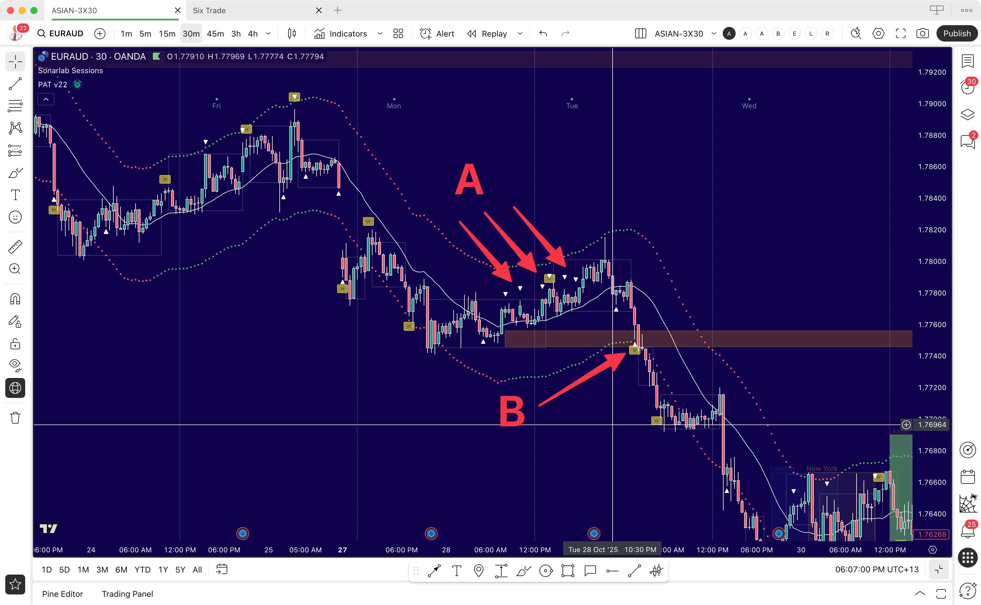
Real-World Example: Buffer Break with Pressure Point Context
The chart below demonstrates Scenario 2: Buffer Breaks. At Point A, notice the buildup of pressure points to the downside (white clustering pressure points)—this shows mounting selling pressure and belief fracturing. Then at Point B, we see the brown buffer zone where a whale marker appears. Price then breaks through that buffer and continues into a significant downward trend.
This example perfectly illustrates how PAT elements work together: Pressure Points reveal the building tension (Point A), the whale marker at the buffer signals high-intent activity (Point B), and the buffer break confirms the shift from range to trend. This is where the 40% trend opportunities emerge—but you’ve identified them through AMD phase awareness, not guesswork.
Whale Markers: The Conviction Multiplier
At buffer rejections: Whales defending a boundary → Higher confidence the buffer will hold → Trade the range with institutional backing.
At buffer breaks: Whales present during containment → When break occurs, their activity provides momentum → The constraint becomes propulsion → Stronger, more sustained moves.
The PAT Advantage
Guidelines for Buffer Trading
These are observational principles, not rigid rules:
- Identify the active buffers: Where are the current boundaries?
- Watch buffer interactions: Is price testing, rejecting, or breaking?
- Check for whale presence: Does institutional activity confirm or amplify the move?
- Understand the mode: Range mode (trade rejections, target opposing buffers) or Break mode (respect the shift, look for continuation)
- Position in the middle: The space between buffers is where you manage trades, not at the edges
- Let AMD phase boundaries guide stops: Place stops beyond buffer breaks (where genuine AMD phase fails), not arbitrary distances
Core Insight
Whale Markers — Manipulation Made Visible
Whale markers represent deliberate, high-intent institutional activity—often liquidity grabs, stop hunts, or strategic positioning. They sit at the top of the PAT interpretation hierarchy because they reveal the truth behind market maker manipulation. Everything else in PAT can be influenced or faked—except the whale markers. They show you where the big money actually operated.
Why Whales Sit Atop the Hierarchy
The Floating Zone can be manipulated (false conviction). Rays can be tested deceptively. Buffers can be faked (false breaks). But whale markers don’t lie—they mark where significant volume and intent actually occurred. When you see a whale marker, you’re seeing institutional footprints. The question isn’t if something important happened—it’s what that event means for what comes next.
What Whale Markers Reveal
When a whale marker appears, it typically signals one of three scenarios:
- Liquidity grab / stop hunt: Market makers push price to trigger retail stops and grab liquidity, then reverse. The whale marks the turning point.
- Institutional accumulation/distribution: Big players entering or exiting positions. The whale shows where they operated, which becomes a new AMD phase level of belief.
- Exhaustion / climax: Final push in one direction before reversal. The whale marks where the crowd’s belief reached its limit and broke.
Note: These three whale behaviors (liquidity grab, accumulation/distribution, exhaustion) describe what the whale marker reveals—not to be confused with the three Playbook Scenarios discussed later, which describe broader trading situations and how to act on them.
How to Interpret Whale Markers
Location is everything. Where the whale appears tells you its significance:
- Whale at a buffer: AMD phase boundary under high-intent pressure. Will it hold (rejection) or break (trend shift)? Watch closely.
- Whale with opposed Floating Zone: The Floating Zone shows one direction, whale appears in the opposite. Classic manipulation setup—prepare for reversal.
- Whale marker aligned with Floating Zone: Institutional activity confirms crowd belief. Trend likely continues with conviction.
Whale + Pressure Points
When you see pressure points clustering on one side and then a whale marker appears on the opposite side, you’re witnessing belief fracturing under institutional pressure. The pressure points show retail positioning (the crowd). The whale shows where institutions took the other side. This combination often precedes sharp reversals.
After the Whale Appears: What Next?
Whale markers tell you where the manipulation occurred and where the truth begins. After a whale appears:
- Note its location relative to ray lines and buffers
- Check Floating Zone direction—aligned or opposed?
- Watch for confirmation (first close in new direction)
- Enter on the pullback after confirmation
- Set stop beyond the whale marker (where manipulation occurred)
The Reversal Signal
The most powerful whale setups occur when: whale appears near AMD phase boundary (ray line or buffer) + The Floating Zone is bending the opposite way + price shows exhaustion. This combination says: “Manipulation phase just happened here, and the real move is about to start in the other direction.” This is where the Manipulation phase both STARTS and ENDS. The whale marks the AMD phase transition point.

Critical Principle
Integration: Reading Complete Setups
You now understand the individual PAT elements—The Floating Zone, Rays, Pressure Points, Buffers, and Whales. But these elements don’t work in isolation. The power of PAT comes from reading them together, understanding how they confirm or contradict each other. This section shows you how to integrate everything into complete trading setups.
Understanding the Framework: Setup Types vs. Scenarios
This manual uses two organizational terms that work together to help you read the AMD cycle systematically:
- Setup Types (explained in this section) are complete integrated patterns that combine all PAT elements together—River + Ray Lines + Buffers + Whales + Pressure Points. They show you what a full AMD configuration looks like when everything aligns. Think of these as "complete pictures" of the AMD cycle.
- Scenarios (explained in the Playbook section below) are specific trading situations you'll encounter and how to act on them. They focus on primary AMD phase behaviors and decision points. Think of these as "action plans" for common AMD cycle conditions.
The relationship: Setup Types show you how to read complete AMD configurations. Scenarios show you how to trade the most common situations within those AMD phases. Both terms describe the same AMD cycle from different angles—one showing the phase, one showing the action.
The Integration Hierarchy
When multiple signals appear, follow this hierarchy of importance:
- Whale markers (top priority—reveals institutional truth)
- Buffers (AMD phase boundaries—defines range vs trend mode)
- Ray lines (remembered belief—context-dependent interpretation)
- The Floating Zone (crowd conviction—can be manipulated)
- Pressure Points (tension indicator—warning, not trigger)
If a whale marker contradicts The Floating Zone, trust the whale. If buffers are holding but ray lines suggest a trend, trust the buffers (you’re in range mode). This hierarchy prevents confusion when signals conflict.
Setup Type 1: Range Rejection Play
What you see:
- Buffers are holding (no breaks confirmed)
- Price approaches upper buffer boundary
- Pressure points clustering below current price (selling pressure building)
- Whale marker appears near the buffer edge
- Floating Zone starting to bend downward (conviction shifting)
What it means: This is a buffer rejection setup. The upper buffer is likely to hold. The whale marks where institutions grabbed liquidity from late buyers. Pressure points show the crowd is overextended. The Floating Zone confirms belief is turning.
Trade approach: Wait for first close below a nearby ray line (confirms rejection). Enter on pullback. Target the opposing (lower) buffer. Stop beyond the whale marker high. You’re trading the range oscillation—buffer to buffer.
Setup Type 2: Trend Continuation After Retrace
What you see:
- Buffer broke with conviction (trend mode confirmed)
- Floating Zone sloping strongly in direction of break
- New ray line forms in the direction of the breakout
- Price retraces (pulls back) but stays above the new ray
- No opposing pressure point clusters (no significant counter-pressure)
What it means: This is trend continuation. The buffer break shifted you from range mode to trend mode. The new ray line is your updated support/resistance. The retrace is natural breathing—not reversal. The Floating Zone confirms conviction remains strong.
Trade approach: Enter as price resumes direction after the retrace (moves back past retrace turning point). Stop at the base of the retrace. Target next buffer or AMD phase level. You’re not waiting for price to return to the original ray line—you’re trading momentum resumption.
Setup Type 3: Reversal at AMD Phase Boundary
What you see:
- Price reaches confluence of ray line + buffer (AMD phase boundary)
- Whale marker appears at this intersection
- Floating Zone is bending opposite to current price direction
- Pressure points clustering on the opposite side of current move
- Price shows exhaustion (wicks, slowing momentum)
What it means: This is a high-probability reversal setup. The whale at the AMD phase boundary marks where Manipulation phase ends. Floating Zone opposed to price = false conviction. Pressure points show the crowd is positioned wrong. All elements align for belief flip.
Trade approach: Wait for first confirmed close in the reversal direction. Enter on the pullback after confirmation. Stop beyond the whale marker. Target the buffer in the new direction. This is the most powerful PAT setup—everything converges.
Setup Type 4: False Break / Trap
What you see:
- Buffer appears to break (price pushes through)
- Whale marker appears immediately after the break
- Floating Zone doesn’t confirm—still bending opposite direction
- Price quickly reverses back inside the buffer range
What it means: False breakout / stop hunt. Market makers pushed price through the buffer to trigger breakout traders and grab their stops, then reversed. The whale marker shows where the trap occurred. The opposed Floating Zone was the warning sign.
Trade approach: Don’t chase the initial break. Wait for the reversal back into range to confirm it was false. Then enter in the direction of the reversal, targeting the opposing buffer. The false break becomes your setup, not your entry.
Reading Conflicting Signals
Sometimes PAT elements don’t align cleanly. When you see conflicting signals:
- Whale contradicts Floating Zone: Trust the whale (institutional reality beats crowd belief)
- Ray line suggests trend but buffers hold: Trust buffers (you’re in range mode, ray lines are pivots)
- Pressure points cluster but no other confirmation: Don’t trade on pressure points alone—wait for AMD phase confirmation or whale
- Everything conflicts: Stay out. Ambiguity = no trade. Clarity will come.
Practical Integration Checklist
Before entering any trade, ask these questions in order:
- Are there whale markers? If yes, where and what do they suggest?
- What mode am I in? Range (buffers holding) or Trend (buffers broken)?
- What does The Floating Zone say? Direction and width (conviction and certainty)
- Where are the nearest ray lines? How do I interpret them given the mode?
- Are pressure points present? Do they add weight or create doubt?
- Do all elements align or conflict? Alignment = high conviction. Conflict = reduce size or skip.
This systematic approach ensures you’re reading the complete story, not cherry-picking signals that confirm your bias.
Your AMD Trading Playbook
How to Read and Trade Accumulation, Manipulation, and Distribution in Real-Time
This playbook shows you how to apply the AMD framework (Accumulation, Manipulation, Distribution/Profit Release) using PAT's visual elements. Every trade scenario below maps to a specific AMD phase: watch for accumulation forming through The Floating Zone, recognize manipulation through Buffer tests and stop hunts, and identify distribution (profit release) through Whale Markers. Understanding which phase you're in determines how you position.
AMD Trading Strategy: The Three-Phase Approach
The AMD trading strategy created by Martin Cole in 1999 is built on a simple truth: Market Makers engineer price movements through three repeating phases. Your job isn't to predict where price will go—it's to identify which phase is active and position accordingly.
Phase 1: Accumulation — Professional capital builds positions quietly. The Floating Zone shows underlying directional momentum forming. Ray lines mark where these accumulation pivots occur. Strategy: Watch and wait. Accumulation is the setup phase—not the entry phase.
Phase 2: Manipulation — Market Makers test belief and hunt stops. Buffers reveal where belief is being tested. Price moves against the eventual direction to trap retail traders and gather liquidity. Strategy: Stay out of manipulation zones. Don't chase false breakouts. Wait for manipulation to end.
Phase 3: Distribution (Profit Release) — The real move happens. Whale markers signal where professional positions are released. The Floating Zone confirms the direction. This is where accumulated profits are realized. Strategy: Enter when manipulation ends and distribution begins. This is your trading window.
The complete AMD trading strategy is simple: identify the phase, wait for manipulation to end (whale marker confirmation), then trade distribution in the direction of the Floating Zone. Don't predict—read. Don't hope—position. Trade the AMD cycle, not predictions.
Before You Trade: Replay and Narrate
Start every trading session with TradingView's replay function. Here's how it works: click the replay button, scroll back to an earlier point on your chart, then press play. The PAT indicator will move forward bar-by-bar, revealing the historical market action exactly as it unfolded—rays, whales, buffers, and all.
As the chart replays, narrate what you see out loud. Talk through where the market maker is positioned, where manipulation is occurring, what you expect to happen next. Better yet, record yourself doing this. This practice isn't just review—it's calibration. You're tuning your mind into the rhythm and flow of market maker behavior before you risk a single dollar.
This is the most powerful preparation you can do. A static chart shows you where price is now. Replay shows you how it got there and trains your instincts to recognize what comes next. Make this your first step, every session, before you even think about placing a trade.
Trust the 30-60 Second Rule
If nothing immediately stands out, that's your cue to step away—not to search harder. Take a deliberate break: walk away from the screen, stretch, grab a coffee. Your subconscious continues processing what you've seen, and often within 15-20 minutes of returning, the clarity you need will surface naturally. Fresh eyes paired with background mental processing frequently reveal insights that forced analysis never could.
Framework in Action: Trade Scenarios
Scenario 1: Whale Reversal at AMD Phase Boundary
Setup: A whale marker appears at a ray line or buffer edge while The Floating Zone bends in the opposite direction. This is manipulation ending—the liquidity grab before the true move begins.
Action: Wait for the first confirmed close away from the ray line in the direction opposite to the initial price thrust. Enter on the minor pullback that follows.
Example: Whale marker appears during an upthrust at a resistance ray line. The Floating Zone is sloping down. Price shows exhaustion. Wait for first close below the ray line (confirms belief flip), then enter on the pullback (retrace up), targeting the buffer below. This is manipulation ending and the true move beginning.
Risk Management: Place stop beyond the whale marker high/low (where the manipulation occurred). If price returns there, the setup is invalidated. Using a 5-minute chart helps identify clean entry points on pullbacks and provides natural stop placement zones.
Scenario 2: Buffer Test with Pressure Point Buildup
Setup: Pressure points cluster near a buffer boundary, signaling belief tension at AMD phase edges. Floating Zone direction aligned with the pressure adds conviction.
Action (if already in position): Consider taking profits as you approach the buffer—especially if you’ve ridden the move from the opposing buffer. Let the buffer reaction guide your next move.
Action (if not in position): Watch the buffer reaction. Does price reject back into the range (buffer holds)? Or does it break through and continue (buffer breaks)? Enter based on the confirmed scenario—rejection for range trading, break for trend continuation.
Risk Management: If entering on rejection: stop outside buffer (where AMD phase boundary fails). Target: opposing buffer. If entering on break: stop back inside the old range. Target: next buffer or AMD phase level. Always be mindful of ADR and new ray lines forming.
Scenario 3: Ray Line Trading by Market Mode
Setup: Ray lines project from areas where belief was historically formed—often between buffer boundaries. How you trade them depends entirely on whether you're in range mode or trend mode.
In Range Mode (Buffer-to-Buffer Trading):
When buffers are holding and you’re trading range oscillations, ray lines act as pivot points and retest zones within that range. You’re not waiting for price to be above/below the ray line to enter—you’re trading the buffer reactions. The ray line positioning simply tells you which side has temporary control as price oscillates. Think of ray lines as internal structure markers, not entry barriers.
Example: Buffer rejects at bottom, price moves up through a ray line toward upper buffer. The ray line cross doesn’t stop your trade—it confirms momentum shift within the range.
In Trend Mode (Buffer Breaks or Directional Moves):
When buffers break or clear directional bias exists, ray line positioning becomes more significant. Acceptance above a ray line while Floating Zone slopes up (or below while slopes down) confirms alignment. After the initial move through the ray line (and often through buffers), price will naturally retrace—pull back temporarily before continuing in the breakout direction.
This retrace may or may not come all the way back to the ray line. Often, it doesn’t. The retrace creates a temporary pause, a few bars where price moves counter to the breakout, then continues. The base of that retrace becomes your reference point.
Example entry scenario: Price breaks above ray line and buffer, river slopes up. Market moves higher, then retraces (pulls back down) without returning to the ray line. The retrace stops, creates a low point. As price moves back up past the point where it turned down to create the retrace, this can be an entry zone—you’re entering as momentum resumes. Stop placement goes at the base/low of that retrace, placed after your entry order fills.
Note: You’re not waiting for price to come back to the ray line. You’re watching for the natural breathing rhythm of a directional move—the retrace—then entering as it continues with belief momentum.
In range mode: Invalidation is a buffer break (not ray line cross). The buffer boundaries define your structure, not the internal ray line pivots.
In trend mode: Ray lines are dynamic—new ones form as the market moves. Your invalidation point isn’t the original ray line from the start of the trend. As you hold a trending position and new ray lines appear, those become your updated reference points.
Example: You’re long in an uptrend. A new ray line forms above the previous one as the market climbs. This new ray line is an early warning zone. If price continues above the new ray line, the trend remains intact. If price moves below that new ray line, it’s an early signal the trend may be exhausting—time to consider taking profits or tightening stops. You don’t wait for price to fall all the way back to the original ray line from where you started; that would give back most of your gains.
Key point: Watch for NEW ray lines as the trend develops. They provide progressive invalidation signals, not the distant original ray line.
Key insight: Don’t let “always above ray line for longs, below for shorts” become a rigid rule. Ray line function adapts to market structure. In ranges, they’re pivot markers. In trends, they’re confirmation zones. Let buffer behavior tell you which mode you’re in.
Keep these playbook steps as your foundation. These are your guiding principles. These principles are fundamental and do not change. What does change is your experience over time and your intuitive understanding of what you’re doing and how you’re interacting with the market maker’s business model. When you know, you know. That is a time when you bend the guiding principles to take immediate advantage of opportunity.
Risk, Timing & Execution
PAT shows you what the market is doing—but knowing when to act, how to size positions, and when to stay out is what separates consistent traders from those who give profits back. This section covers the practical execution principles that protect your capital.
Confirm on Close
PAT’s core signals align to confirmed bars—meaning the candle has closed and the signal is finalized. Jumping in before confirmation leads to impulsive entries based on incomplete information. A whale marker that appears mid-bar might disappear by close. A ray break that looks certain might reverse.
Practical application: Wait for the current bar to close before making decisions. Use alerts on your trading platform to notify you when bars close on your chosen timeframe, then assess the confirmed signals. This discipline alone eliminates many false entries.
Respect Average Daily Range (ADR)
ADR is the average distance price travels in a single day, typically measured over the last 20-30 trading days. It tells you how much “room” the market normally has to move on a given day.
Why it matters: If the current day has already moved 80-90% of its ADR, most of the opportunity is gone. Entering at this point means you’re chasing a move that has little room left to run. Your risk-reward becomes unfavorable even if your setup is perfect.
How to use ADR:
- Check how much of the ADR has been consumed before entering a trade
- If 70%+ of ADR is done, reduce position size or tighten profit targets
- If 90%+ of ADR is done, consider waiting for the next trading session
- Use ADR to set realistic profit targets based on what the market typically delivers
Example: EUR/USD has an ADR of 80 pips. Today it’s already moved 70 pips. Even if you see a perfect whale + ray setup, you only have ~10 pips of realistic room left. Either skip the trade or take a much smaller position with tight targets.
Timeframe Selection
PAT works on any timeframe, but your trading style determines which you should focus on:
- 5-minute chart: Excellent for entry timing and identifying clean pullback zones. Shows natural stop placement areas.
- 15-minute to 1-hour: Best for day trading. Reveals intraday structure (rays, buffers, whales) with enough detail for precise entries.
- 4-hour to daily: Swing trading and position trades. Shows major structural levels and longer-term belief shifts.
Multi-timeframe approach: Use higher timeframes to identify the structural setup (buffer break, ray position, River direction), then drop to lower timeframes (5-min or 15-min) for precise entry on pullbacks.
Position Sizing
No setup is certain. PAT gives you edges, not guarantees. Proper position sizing ensures that even when you’re wrong, you live to trade another day.
- Risk per trade: Never risk more than 1-2% of your account on a single trade. If your stop is hit, you lose 1-2%—not enough to emotionally affect you or significantly damage your capital.
- High-conviction setups: Whale + ray + opposed River = maximum position size (within your 1-2% risk limit). All elements align.
- Lower-conviction setups: Only partial signals align = reduce position size to 0.5-1% risk. Take the trade but protect yourself.
- Wide stops: If structure requires a wide stop (e.g., beyond distant buffer), reduce position size to maintain your 1-2% risk tolerance.
When to Stay Out
Not every session offers good setups. Knowing when to stay out is as important as knowing when to enter:
- Wide, choppy Floating Zone: High uncertainty, low consensus. Market is confused—you will be too.
- ADR exhausted: Day’s range already consumed. Wait for next session.
- No clear structure: No nearby rays, no defined buffers, no whale markers. Nothing to work with—don’t force it.
- Conflicting signals: Floating Zone says one thing, whale says another, buffers are unclear. Ambiguity = stay out.
- Major news events: High-impact economic data can override all technical structure temporarily. Stand aside until the reaction settles.
The Baseline Trading Philosophy
This is the single most powerful principle for trade management:
- Enter on a confirmed single belief premise about the future. Example: “Price will move to the buffer below because whale appeared at resistance ray and The Floating Zone is bending down.”
- Exit when the premise becomes truth (Win). Price reached the buffer. Premise fulfilled. Exit.
- Exit the moment the premise would no longer be valid or is destroyed. Example: New ray forms and price moves back above it. Your original premise (move to buffer below) is now invalid. Exit immediately, even at a small loss.
Key insight: The moment you wouldn’t enter the trade if you weren’t already in it—that’s the moment you exit. Don’t hold positions based on hope. Hold them based on whether the structural premise still exists.
Front Testing vs Backtesting: Why Live Edge Learning Matters
The PAT Indicator and our education system are designed to help you read the beliefs of the market as the market unfolds in real-time. This fundamental approach requires a learning methodology that aligns with real trading conditions—which is why we advocate front testing over traditional backtesting.
Why Backtesting Falls Short
Backtesting removes you from the most critical aspect of trading: the psychological reality of making decisions in uncertainty. When you backtest, you’re always guessing where your order might be filled and guessing where it should be exited. It’s simply not the real world.
More importantly, backtesting doesn’t allow you to form the intuitive understanding and connection to the market that you need for successful trading. It creates a false sense of security and trains you to think mechanically rather than developing genuine market intuition.
The Psychological Cost of Backtesting
Research has identified significant psychological drawbacks to relying on backtesting:
- Missing Emotional Factors: Backtesting removes key emotional elements inherent in live trading—fear, greed, hesitation, and the pressure of real capital at risk. This creates a disconnect between backtest results and how you’ll actually behave in real markets, affecting your decision-making skills and the emotional resilience needed for live trading.
- Misplaced Confidence: Traders often develop overconfidence from backtesting since there’s no actual money involved and no real-time risk. This can lead to poor live execution and unrealistic expectations when real capital is at stake.
- Emotional Biases Not Captured: You may stick strictly to rules when viewing historical data but override strategies impulsively during live trading due to psychological factors. The offline backtesting mindset differs significantly from live market psychology.
- Incomplete Learning: Backtesting alone fails to teach you how to manage drawdowns, slippage, or news volatility because those elements rarely appear realistically in simulated tests. The absence of emotional learning and real-time decision pressure impairs development of crucial trading discipline, adaptability, and risk management skills.
- Superficial Understanding: Backtesting risks building a mechanical understanding of markets rather than developing the intuitive, experience-based insights needed for live trading success.
The Front Testing Approach
Instead of backtesting, we advocate what we call front testing—learning at the live edge of the market with real capital at stake.
How it works: Use very small position sizes that have no meaningful financial impact on you whatsoever—but enough that it keeps everything 100% real. The key is that even though the amount is tiny, it’s real money, which creates the authentic psychological conditions necessary to develop true trading discipline.
Why Front Testing Works
- You trade at the live edge where you must make real decisions, manage real fills, and experience real market uncertainty
- You develop genuine intuition by reading market beliefs as they unfold in real-time, not after the fact
- You experience authentic emotions—even with tiny amounts, real money creates the psychological conditions that matter
- You learn to read market maker beliefs as they develop, not in hindsight
- You develop pattern recognition and intuition that only comes from real-time observation
- You experience the emotional journey of waiting for setups, managing uncertainty, and executing decisions
- You discover how actual fills, slippage, and market conditions affect your results
- You build the psychological resilience needed for sustainable trading success
The Psychology of Real Money (Even Small Amounts)
Research and expert commentary emphasize that backtesting provides useful statistical insights but is psychologically insufficient to prepare traders fully for live conditions. Trading educators warn that relying solely on backtesting can create illusions of certainty and psychologically harm trader development by fostering unrealistic expectations and neglecting live trading dynamics.
The critical difference: Scrolling back through historical charts and backtesting are fundamentally different from learning at the live edge. It’s chalk and cheese. When you front test with PAT, you’re learning the way the market actually works—in real-time, with real uncertainty, and with real consequences (however small).
Practical Guidelines for Front Testing
- Start with the smallest position size your broker allows that still executes reliably
- Focus on the process, not the profit—you’re paying tuition in time and tiny amounts to build real skills
- Keep a journal of live edge observations—what you felt, what you saw, what you learned
- Gradually increase size only after demonstrating consistent discipline at the current level
- Treat every front test trade as if it were full size in terms of analysis, entry criteria, and exit discipline
- Use replay mode for general pattern familiarization, but never as a substitute for live edge learning
The Bottom Line
Whale Trend Line (Beta)
The Whale Trend Line is currently in beta mode and subject to further testing. This feature connects whale markers to potentially reveal institutional positioning patterns. However, we are still gathering data and trader feedback to determine its reliability and effectiveness in live trading conditions.
Treat this feature as experimental. If and when the Whale Trend Line proves to be a powerful and reliable tool, comprehensive guidance and detailed examples will be added to this manual. Until then, use it cautiously and at your own discretion.
We welcome your feedback. If you have observations, results, or insights about the Whale Trend Line’s performance in your trading, please submit your input for consideration. Your real-world experience helps us evaluate whether this tool should become a core part of the PAT framework.
The video below demonstrates the basic concept of whale trend lines for those who wish to experiment with this feature.
FAQ & Glossary
- The Floating Zone: The adaptive belief midline + upper and lower lanes
- Ray line: Projected midline from a completed accumulation box - pivotal belief line
- Pressure Point: Triangle-based marker signaling belief fractures.
- Buffer: Shaded zone where belief changes hands.
- Whale Marker: High-intent activity; often the end of manipulation and start of the true move.